
Sections:
- 1. Introduction
- 2. Prior Work
- 3. Data Description
- 4. Exploratory Analysis
- 5. Full Network analysis
- 6. Final comments
- References
Introduction:
Transportation networks offer a fascinating opportunity to identify local population’s travel habits, daily routines and a usage-data driven way to augment city-planning decisions. In our analysis, we focus on exploring travel patterns of New York City residents using 146+ million taxi trips taken for the year 2015. The complete code, visualizations & reports are available in the Github Repository
Prior work:
GPS based transportation networks have been studied in detail for traffic flow analysis and determining social dynamics[1]. Bike sharing datasets have been used for clustering locations based on the usage profile[2] and predicting bike demand[3] GPS based taxi datasets have been used to identify mobility patterns in Shanghai, China[4].
In[4], the trip distribution has been characterized as combination of 3 independent types and non-negative matrix factorization has been used to identify 3 patterns from 1.58 million trips in Shanghai, China. This is the core of our approach, as we are attempting to characterize taxi usage in New York City with a similar dataset. Prior analysis has also been done to produce transportation network graphs from street geometries[5] and subway maps[6].
Data Description:
a) Raw data :
New York city taxi & Limousine Commission has made the taxi trips dataset available for public use since 2009 onwards[7] . We used this dataset to perform our analysis. The complete dataset contains ~150 million trips for each year & each row represents one trip, with features for starting and stopping point, distance travelled, taxi-charge, time taken etc. We are using 2015 dataset which contains 146,112,990 trips in total. For combining the geolocation data to census tracts, we used the extremely helpful NYC landuse dataset[8].
b) Data transformation :
We use the following variables for each trip:
- Trip starting timestamp
- Start point (Lat/Long)
- Trip stopping timestamp
- Stop point(Lat/Long)
- Charges
Using these trips, we build our directed graph with start and stop location for a given trip as nodes. As an additional condition, we only used locations with high number trips (more than 500 in the year for a given pair of locations). From prior work we summarized that rounding off location coordinates to 2 decimal points is also an option and given our difficulties analyzing the dataset with 40,000+ nodes, we are now in the process of reducing our network by 2 separate approaches:
- One node for 5 manhattan blocks
- Using 6 million most frequent trips to get 1275 most frequently travelled edges.
- In our current network, each node represents 200m x 200m around it and each edge represents the total number of trips between two nodes in a given year.
We create features for month, day, wekday, period of the day etc from the timestamp. An issue that we faced during our initial analysis was that due to geography of the network itself, we had a network where multiple nodes represented the same location due to multiple entrances (e.g. Penn station ahs multiple entries and exits & our network had multiple nodes representing essentially the same real world location)
Same location : multiple close nodes

We finally decided to merge our dataset with US Census Bureau census tracts which removed the above problem. We have 580+ nodes in the final network and are worked with analyzing census tract as node and number of trips between two census tracts represented as an edge.
Exploratory Analysis:
1 . Trips taken in each month(fig-i) peaks between March-May and drops substantially during June onwards. This can be attributed directly to the weather pattern, as commuters are expected to avoid walking long distances during low temperatures or rainy weather.

2 . For our full dataset, the degree distribution is shown in first plot whereas the second plot shows degree distribution for graph generated using edges with atleast 500 trips in 2015.

3 . The heat-map (fig iii) shows relative trip-density for each hour of the day in 2015. From this information, we summarize that the busiest hours are 6AM to 9AM. We attribute most of this traffic to users on their daily work-commute whereas there is a remarkable increase in density between 12AM to 4AM on weekends. We are looking for an approach to perform similar analysis on the network structure generated from our subset, to create temporal traffic density visualization.

4 . We analyzed the cost vs duration relationship for the trips and found interesting abnormal number of constant cost trips. We are attributing these trips to:
-
Tips being rounded off to nearest 5/10
-
Traffic delays within the same trips leading to delays

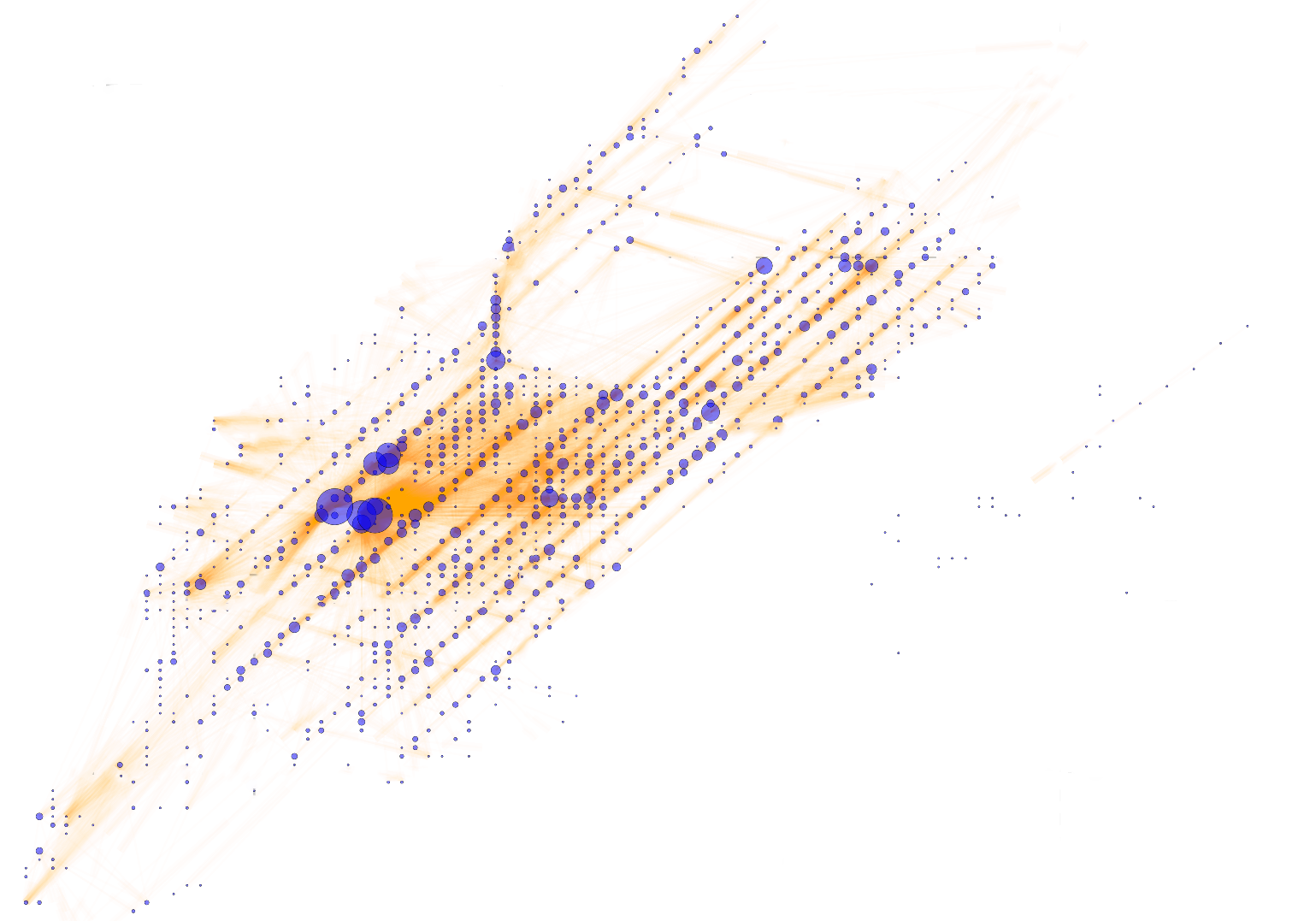
Full Network analysis

The full network is approximately represented on its actual geographic location and we have mapped out-degree to node size & trips as edge thickness. We observed that:
- The suburbs are served less than Manhattan, Upper east/west and downtown
- Transportation hubs are also network hubs and office areas are the next closest central nodes
- Surprisingly, east village & lower east side is also least connected of the complete network, even though these areas are not geographically separated like the suburbs

When we divide our nodes into two subcategories by number of trips greater than or equal to 500 and less than 500 respectively, and plot them in-degree/out-degree against the total number of trips, two stark contrast appear. The top two graphs on Figure 5 speak for nodes with number of trips greater than or equal to 500, with blue graph marks the in-degree to trips ratio and the red graph for out-degree. The bottle two graphs are for nodes with number of trips less than 500.
For number of trips>=500, most of the outliers on the far right of the graphs have their physical locations in Madison Square Garden, Penn Station such inner city attractions. This means that a large number of people coming to these attractions from relatively small number of places and most of these in-coming places are located in Manhattan (e.g. 250,000 trips coming from about 200 places. On average 1250 trips from a single locale).
For number of trips >=500, most of the outliers on the far right of the graphs have their physical locations in Airports (LaGuardia as well as JFK), and their trips versus degree ratio is much smaller, meaning that a small amount of people coming from all sorts of places. And we can easily identify places with low connectivity by looking at the “tail” of the plot, and we found out that the smaller this ratio is, the farther away the node is from Manhattan.

We divided the network into 3 communities, using multilevel community detection in igraph. The above plot has these communities mapped by size to number of trips leaving each node in the whole year. The 3 communities can be described as follows:
- The Blue labels represent community A, and the nodes neatly fall into Manhattan and adjoining New Jersey areas which turn out to be most well connected nodes. They are well connected to Manhattan (Manhattan as well as New Jersey locations) and the other two communities (Only Manhattan locations)
- The Green labels represent community B, and it represents the locations with highest taxi connectivity to north parts of the city which in turn is due to least city transport connectivity (Bus/Metro etc) – towards north in general
- The red labels represent community C, representing north NYC, Queens & Bronx which we understand are in the same community due to least connectivity towards south in general.
- We wanted to show determine if the Suburb structure as determined by Dash & Rae[11] using national dataset holds true at a local level, and that’s why this result is interesting – based on our primary exploration our inference is, that within a city, it doesn’t hold up.

We plotted a snapshot of the trips leaving major NYC areas and this shows, Manhattan is the most connected of all, whereas most trips from Lower east side, East village & Brooklyn end up towards northern sides of NYC. With a small fraction ending up within the community itself.
Final comments
-
Cities are different from other networks in the sense that minor rerouting is usually pretty straighforward i.e. a detour of one block is easy to take and usually does not lead to significant change in cost, time or length of the route.
-
A city like New York won’t have a single critical location apart from the structural hubs (Metro hubs, airports & bus hubs) – this is pretty apparent from the degree centrality analysis. The closest thing to a central location in NYC is its avenues, specifically Broadway & 6th avenue. Broadway runs North to South whereas 6th Avenue runs South to North (one-way routes).
-
Another interesting observation from the analysis is that East village & below is similar to suburbs in terms of taxi usage. This is surprising because as stated by Tobler, the first law of geography is “everything is related to everything else, but near things are more related than distant things.”[12] & this first law is the foundation of spatial dependence and spatial autocorrelation utilized specifically for the inverse distance weighting method for spatial interpolation[13].
References:
- P. S. Castro, D. Zhang, C. Chen, S. Li, and G. Pan. From taxi gps traces to social and community dynamics: A survey.ACM Comput. Surv, December 2013.
- C. Etienne and O. Latifa. Model-based count series clustering for bike sharing system usage mining. ACM Trans. Intell. Syst. Technol., July 2014
- D. Singhvi, S. Singhvi, P. Frazier, S. Henderson, E. Mahony, D. Shmoys, and D. Woodard. Predicting bike usage for new york city’s bike sharing system. In AAAI Workshops, 2015.
- Peng C, Jin X, Wong K-C, Shi M, Lio P (2012) Collective Human Mobility Pattern from Taxi Trips in Urban Area. PLoS ONE 7(4): e34487.doi:10.1371/journal.pone.0034487
- P. Crucitti, V. Latora, and S. Porta. Centrality measures in spatial net-works of urban streets. PHYSICAL REVIEW E, 73(3):036125, 2006.
- Derrible S (2012) Network Centrality of Metro Systems. PLoS ONE 7(7): e40575. doi:10.1371/journal.pone.0040575
- NYC taxi data: http://www.nyc.gov/html/tlc/html/about/trip_record_data.shtml
- NYC land use: https://www1.nyc.gov/site/planning/index.page
- W. Cui, H. Zhou, H. Qu, P. C. Wong and X. Li, “Geometry-Based Edge Clustering for Graph Visualization,” in IEEE Transactions on visualization and Computer Graphics, vol. 14, no. 6, pp. 1277-1284, Nov.-Dec. 2008 doi: 10.1109/TVCG.2008.135
- Holten, D, & Wijk, J 2009, ‘Force-Directed Edge Bundling for Graph Visualization’, Computer Graphics Forum, 28, 3, pp. 983-990, Business Source Premier, EBSCOhost, viewed 12 November 2016.
- Dash Nelson G, Rae A (2016) An Economic Geography of the United States: From Commutes to Megaregions. PLoSONE11(11):e0166083.doi:10.1371/journal.pone.0166083
- Tobler W. A computer movie simulating urban growth in the Detroit region. Economic Geography 1970;46: 234–240.
- https://en.wikipedia.org/wiki/Tobler’s_first_law_of_geography